Components
Every Rails UI app kit ships with a complete design system and Rails-native components: forms, navigation, dialogs, tables, authentication screens, mailers, and the small states that make a product feel finished. You can use them inside a kit or independently in any Rails view.
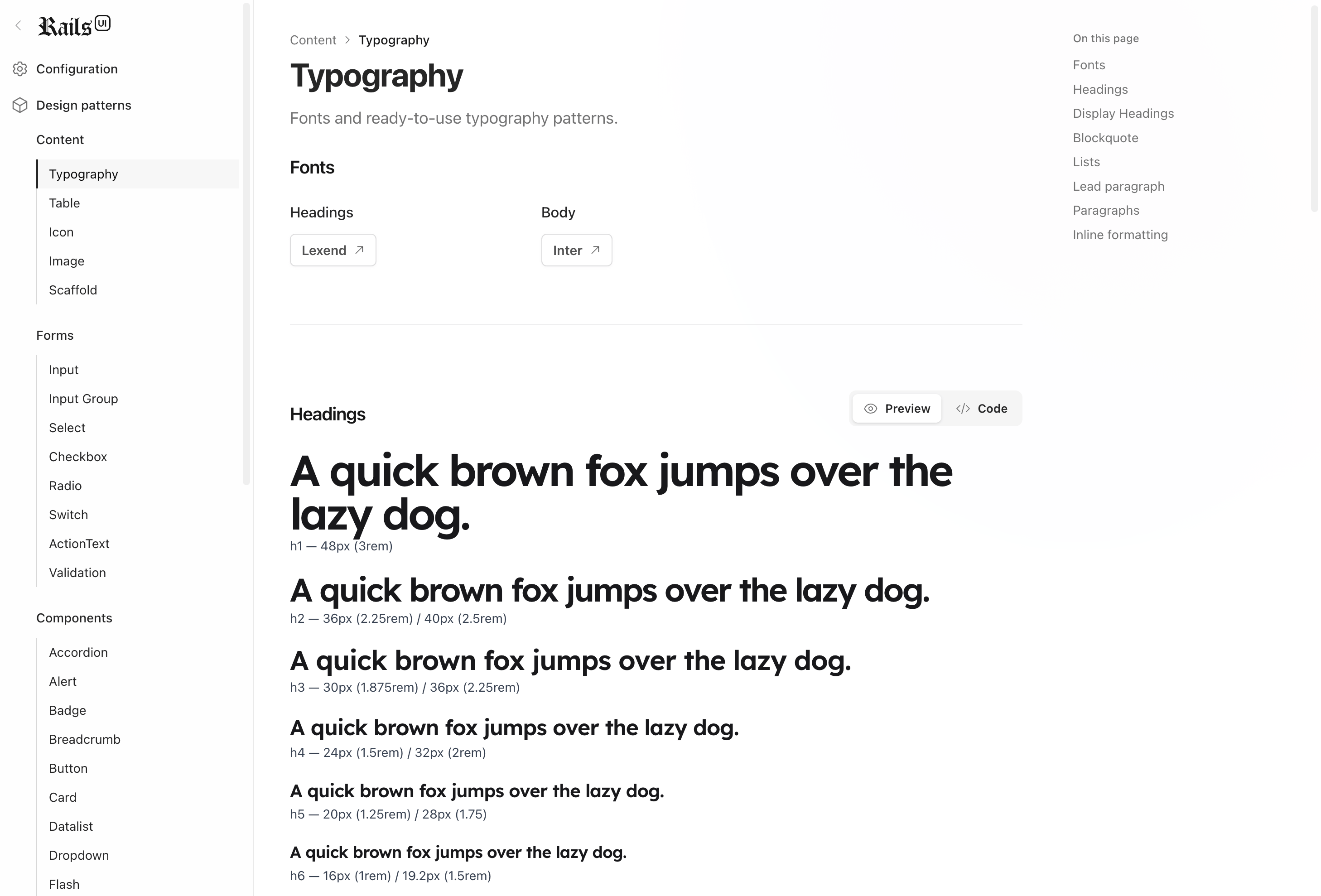
Content
Content patterns cover typography, image formatting, table layouts, prose, and text treatments that keep a product screen readable after real copy and real records arrive.
UI components
From form inputs to complex modal dialogs, these components give you branded product UI with Stimulus already wired where interaction belongs.
Rails UI separates product design from application logic. The markup is plain ERB and Tailwind, so you can customize it directly, compose it into new screens, and hand it to an AI assistant without translating from another framework first.
Authentication
Professionally designed authentication views with Devise support. Every view, email template, and integration is tailored for Devise. A static version is also included for custom authentication solutions.
Earlier versions of Rails UI included Devise directly, but we removed it for flexibility. Version 3+ offers snippets for Devise or custom authentication methods.
TL;DR: You handle the logic, Rails UI handles the UI. It's drop-in ready.
Mailers
Custom email templates and mailer layouts optimized for responsive design. Includes transactional, promotional, and minimal styles, with more coming soon.
Snippets
Each pattern features one-click copying for quick integration into your app. Available in HTML and ERB formats, with conventions that match the larger app kits.